1 min read

Color's Impact On Branding

Color's Impact On Branding

When it comes to identifying your brand, your logo is more than likely the first thing your customers will think of. A brand’s logo and visual identity will be made up of a number of visual elements, such as shapes, symbols, number, and words. But the number one visual component that people remember most is color. Our brains tend to focus on brands and imagery that are immediately recognizable and color association has a great deal to do with this.

As a quick experiment let’s see what happens when we swap colors of some well known logos. How does this make you feel about the brands? You more than likely will find is that it feels off-putting because of how ingrained the colors of major brand logos are in our perception of their designs. It shows how important it is to balance the two elements.

 
Netflix and Hulu colors reversed

Google and Yahoo colors reversed

Walmart and Target colors reversed

Fedex and UPS colors reversed

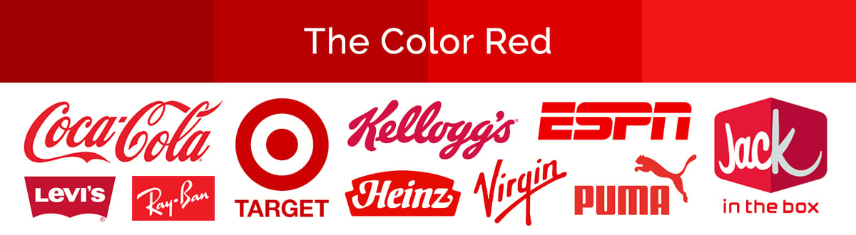
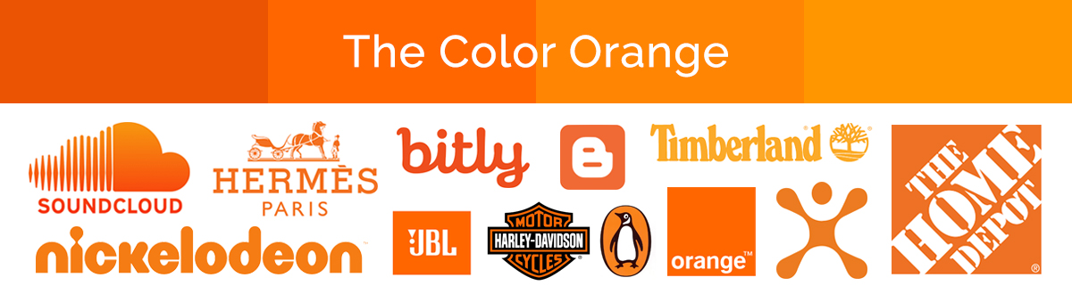
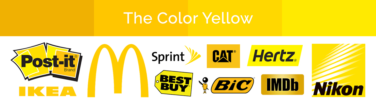
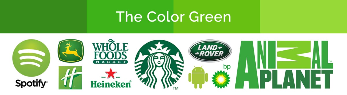
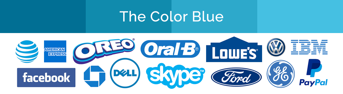
Color is an essential part of the world of graphic design and advertising. It plays a crucial role in visual communication by stimulating our senses and producing an emotional response. In developing a brand we should not only think about creating elements that visually look nice but about connecting to the people we are targeting. To do this we need to first think about the mood and message you want to convey to consumers.

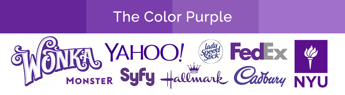
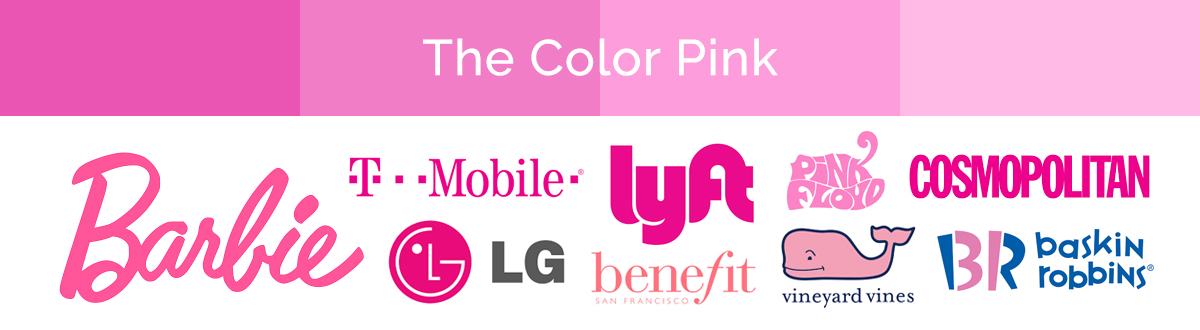
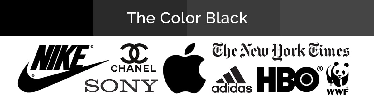
In order to evoke the right mood, you should understand the basics of color psychology. Each color family has its own emotional meanings and psychological associations, so it’s useful to be aware of them. This way, you can pick a color that aligns with your product’s message. Here are some colors, and the words that are most commonly associated with them:


Compilation of red logos
 
RED: Boldness, Passion, Danger, Aggression, Excitement, Energy, Action, Hunger, Warmth
 
 
Compilation of orange logos
 
ORANGE: Fun, Energy, Enthusiasm, Youth, Creativity, Warmth
 
 
Compilation of yellow logos
 
YELLOW: Optimism, Enlightenment, Happiness, Speed, Hunger, Caution, Warmth, Communication, Stimulating
 
 
Compilation of green logos
 
GREEN: Life, Nature, Organic, Health, Soothing, Freshness, Money, Healing, Tranquility, Renewal
 
 
Compilation of blue logos
 
BLUE: Business, Trust, Authority, Dependable, Power, Confidence, Wisdom, Commitment, Calming
 
 
Compilation of purple logos
 
PURPLE: Wealth, Mystic, Royalty, Power, Mystery, Luxury, Spirituality, Creativity
 
 
Compilation of pink logos
 
PINK: Youthful, Femininity, Romance, Fun, Beauty, Compassion
 
 
Compilation of black logos
 
BLACK: Authoritative, Powerful, Sophisticated, Luxury, Elegance, High-end
 

It’s important to remember that there is no real right or wrong when it comes to your brand's color. Color theory is not necessarily a law that must be followed in branding, but its an important thing to learn and understand if you want to send the right message about your brand.
Color trends are always changing and here at Boombox you can rely on us to keep up to date with them and to help your brand reach it’s full visual potential.
 
Contact Boombox
Using Segmentation to Improve Sponsorships & Activations

Using Segmentation to Improve Sponsorships & Activations

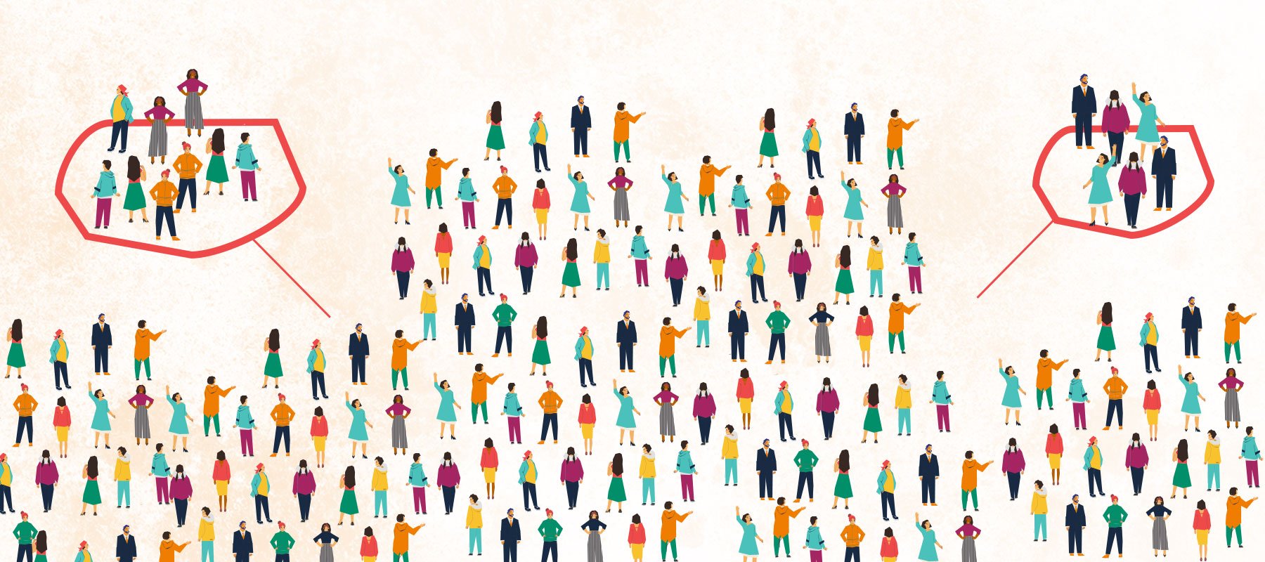
What do you think of when you hear the phrase “diverse sponsorships?”

Read More
Shut Down the Shade: How to Respond to Backlash to Your Pride Campaign

Shut Down the Shade: How to Respond to Backlash to Your Pride Campaign

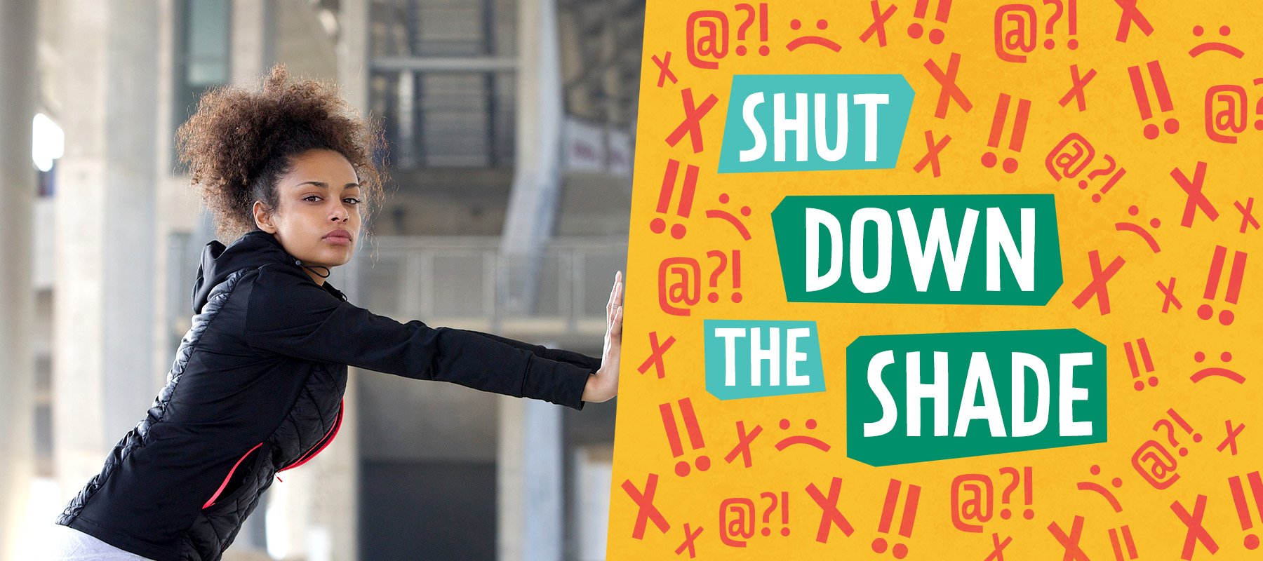
Come June,we can expect to see the usual suspects up in arms about brands engaging in (or even supporting) LGBTQ+ Pride campaigns. Of course, not...

Read More
The Power of Podcasts: How Audio Mediums Can Boost Your Brand

The Power of Podcasts: How Audio Mediums Can Boost Your Brand

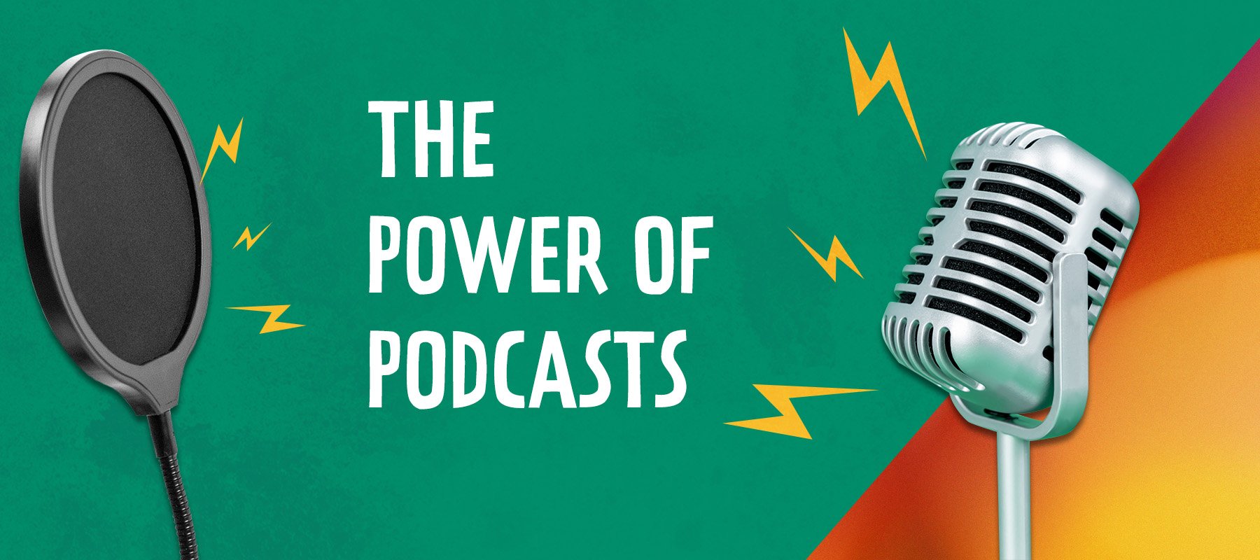
First things first: what is a podcast?

Read More