 Beau Moss
Using Segmentation to Improve Sponsorships & Activations
What do you think of when you hear the phrase “diverse sponsorships?”
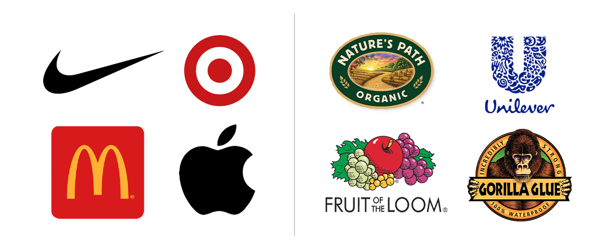
Logos are generally considered the face of your brand, and naturally they are the first touchpoint consumers have with you. Recognizability is everything when it comes to the success of a logo, and there are many types and styles of logos that dominate the world today. Some are simple like Nike and Target and some are more complex like Fruit of the Loom and Unilever.
So should your logo be simple or more complex? There is no real right or wrong answer. Although the majority of designers will tell you simple is the route to go, there are several successful brands that use very complex logos and designs. Below we’ll help navigate why both are explored and how they can influence your audience.
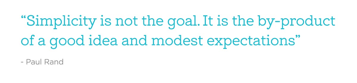
One of the most basic factors of a simple logo is that it should be recognizable at a glance. Simple logos are easier to absorb and understand, making them quick to notice and remember. The simplicity of the design attracts attention and helps customers remember your specific business. However, there’s a thin line between simple and plain, and simplicity shouldn’t be confused with lack of creativity. In fact, the process should involve hundreds of ideas refined to a clear mark that tells the story of your brand through creative use of the elements and space.
 Complex logos can be equally impressive if they are carefully created with a purpose. A common reason for adopting a more complex logo is usually to incorporate more information. A logo that has more elements in the design such as colors and images can help make you stand out among competitors. However there is the possibility that a complex logo with too much going on in it can confuse your audience.
It’s also very important to think about where the logo will be placed and how it will be used. Whether a logo is going to be placed digitally or in print, it will need to be resized according to the needs. While a complex logo may seem intriguing, you want to ensure your design is presentable. In most cases, the shrinking of complex logos results in losing details and visibility problems.
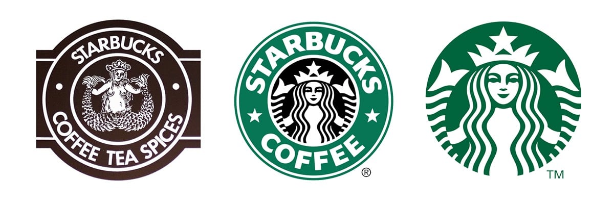
Many well-known companies started with more complex logo designs, then simplified as their brands became more widely recognized. Here are some examples of some companies who have simplified their logo.
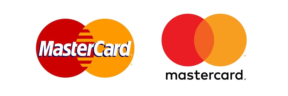
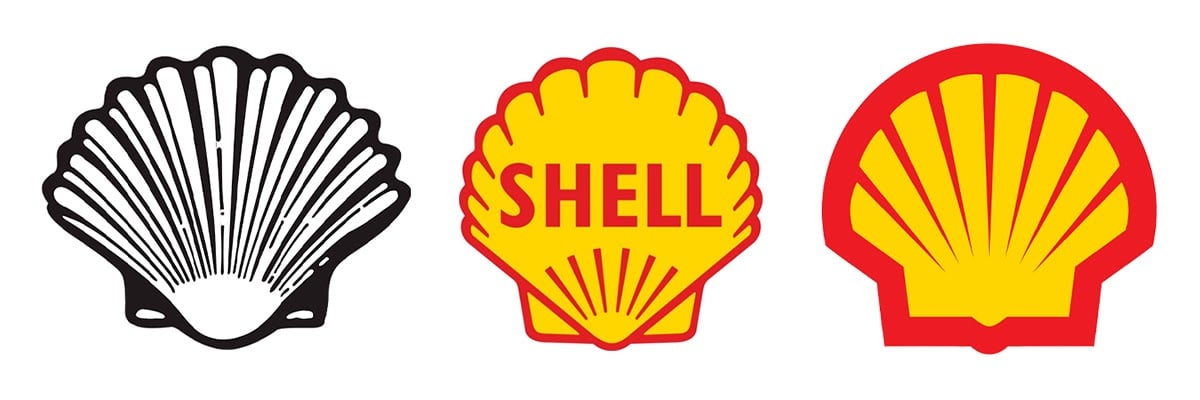
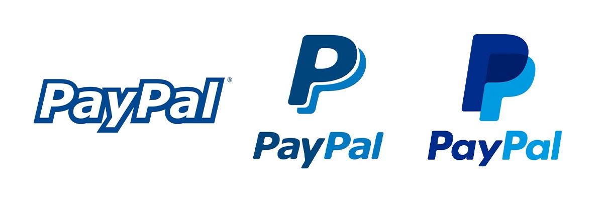
Ultimately, the type of logo you choose will depend on the needs of your business and your target audience. In my opinion, an over-complicated logo is very rarely a great design and is much harder to work with for your business needs. Often a simpler logo will be most suitable for clearly conveying your company’s purpose while remaining identifiable.
Do you think it’s time to redesign your logo or need help with a new brand? Let the brand experts at Boombox help you decide which type of logo best suits you.


What do you think of when you hear the phrase “diverse sponsorships?”

Come June,we can expect to see the usual suspects up in arms about brands engaging in (or even supporting) LGBTQ+ Pride campaigns. Of course, not...

First things first: what is a podcast?