Using Segmentation to Improve Sponsorships & Activations
What do you think of when you hear the phrase “diverse sponsorships?”

One thing you need to consider when designing websites is the contrast ratio between text and background color. For example, we've all seen instances where a brand, in an attempt to appear “high-end” or elegant, will use light grey text over a white background. We squint our eyes and try to suppress the headache we know is coming in an attempt to consume this content, all while wondering, “Did anyone test this?” This situation arises for everyone at some point regardless of their eye-sight. Also, differences in monitors and environmental variables can all have an impact on legibility. Ever use your phone in the bright sun? It can be brutal.
Fortunately, the Web Accessibility Initiative (WAI) publishes the Web Content Accessibility Guidelines (WCAG), to address color ratios and a slew of other accessibility concerns. View the full WCAG here for more information.
Contrast ratios are written as a ratio of text-color luminance to background-color luminance. The values range from 1:1 (no contrast) to 21:1 (maximum contrast). In order to comply with the WCAG, the following values must be met and/or exceeded:
The WCAG defines "large scale text" as at least 18 point or 14 point bold or font size.
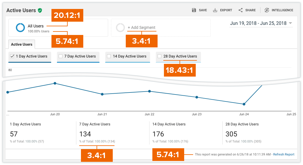
 This is a screenshot of a Google Analytics dashboard with various contrast ratios identified.
If you find your color contrasts are not high enough, don't be afraid to break out of your style guide in certain instances. You can usually increase contrast by subtly making your text lighter or darker, and no one will notice that the grey may not exactly match your logo.
Use this color contrast checker tool by WebAIM to check your compliance. Put your text color value in the “Foreground Color” box and your background color value in the “Background Color” box. The tool will then calculate the contrast ratio.
 WebAIM Color Contrast Ratio tool
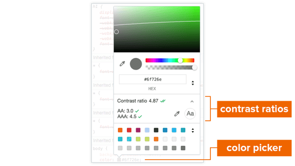
Google Chrome's dev-tools now has built-in support for contrast ratios.

Contrast ratios in Chrome Dev-Tools
The ColorZilla add-on currently supports Google Chrome and Firefox.
 ColorZilla browser add-ons
So, before you make that site live, check your color contrasts to make sure they're not only easy on the eyes but easy on any tablet, laptop, monitor or screen.

What do you think of when you hear the phrase “diverse sponsorships?”

Come June,we can expect to see the usual suspects up in arms about brands engaging in (or even supporting) LGBTQ+ Pride campaigns. Of course, not...

First things first: what is a podcast?