 Amanda Kaay
Using Segmentation to Improve Sponsorships & Activations
What do you think of when you hear the phrase “diverse sponsorships?”
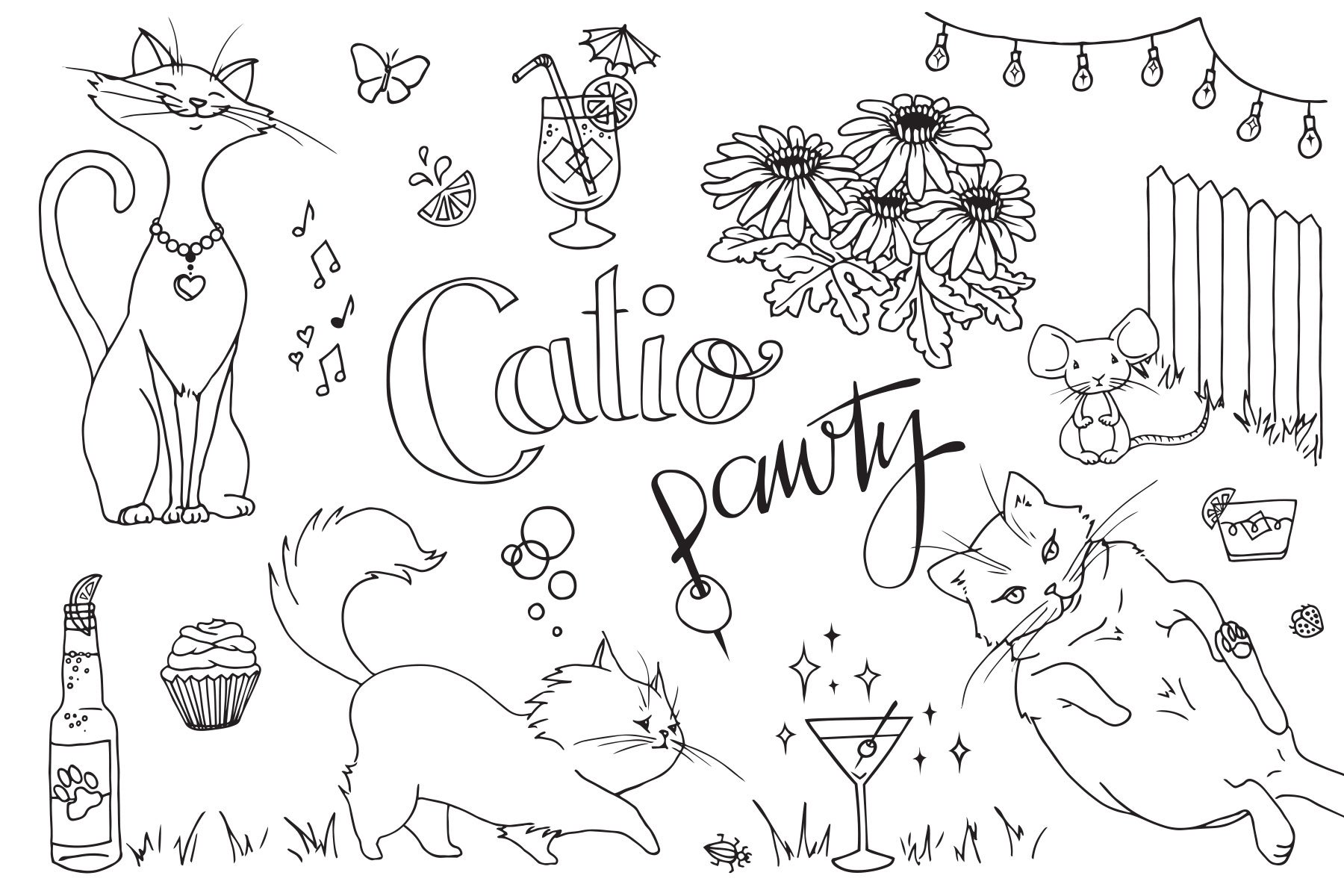
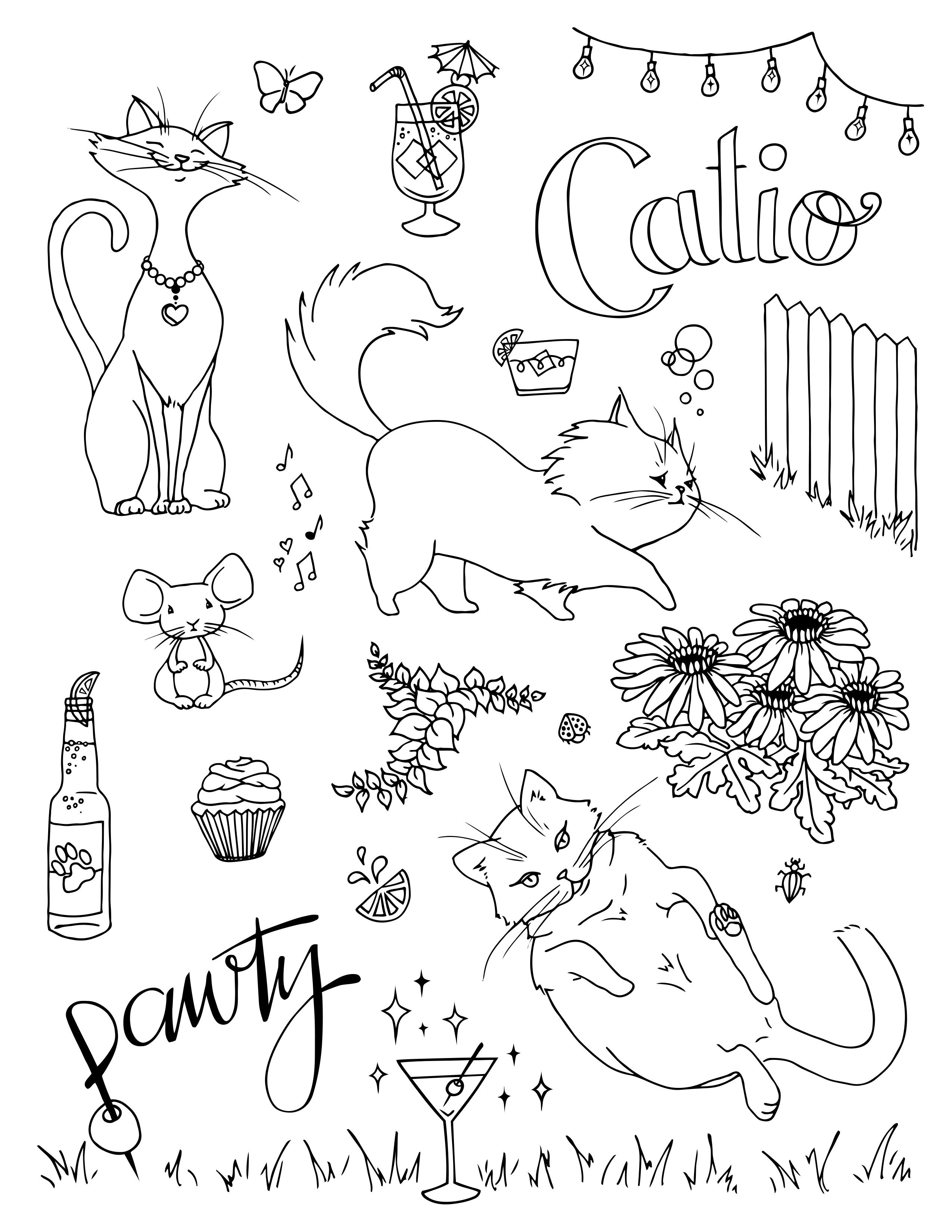
Say you want to add some imagery to your project - but in this day and age not just any stock graphics will do. They have to be unique, original, and they have to add some character. You may have sketched out an idea with a pen and paper, but how to take it to the next level? I'll show you what I did with my “Catio Pawty” design, and some tips on vectorizing a hand-drawn illustration, in 3 simple steps. Free downloads of my final vector illustrations are available at the bottom of this page!
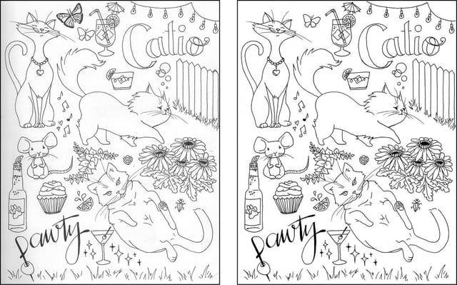
Here’s the original sketch I scanned into Photoshop, on the left, and with some preliminary clean-up on the right. You want to get rid of most of the greys, leaving a fully white background and black ink, and remove any parts you don’t want in your final illustration. In this case I had an ugly butterfly to remove (oops!), a bunch of soft pencil lines that hadn’t erased completely from the page, and a few stray marks that I didn't want. I used “levels” in Photoshop to get it close to where I wanted it (brighten the whites and darken the blacks), then went back over the drawing with the “dodge” tool on any grey parts that still needed brightening up. I also used the “brush” tool with simple black and white to go over any little spots or pencil marks left on the page until it looks clean. Keep your scan as hi-res as possible (300dpi or more) and save it as a Photoshop doc to avoid any compression.
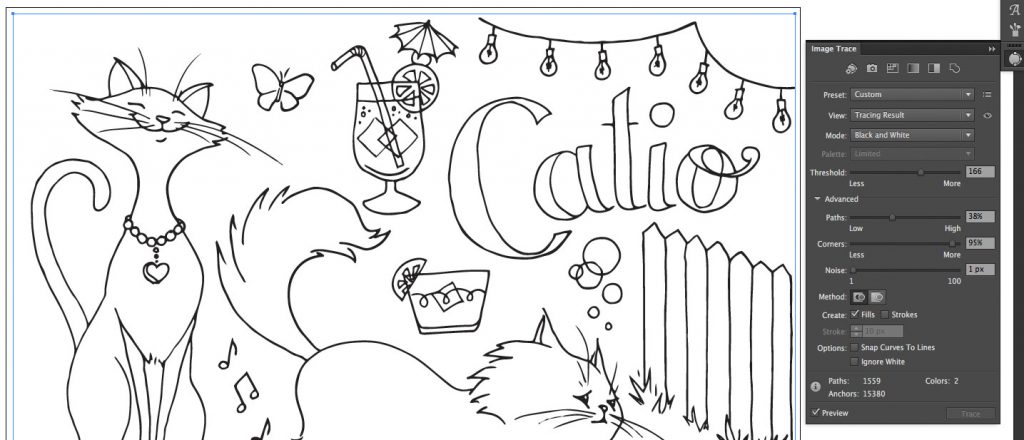
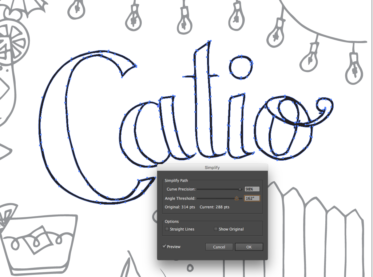
At this point I moved over to Adobe Illustrator and brought out the big guns: Image Trace. Place your .psd into a new Illustrator document, and make sure you have the “image trace” options window open (it can be found under “Window”). Here’s where it gets tricky, and you’ll want to play around with these options until you find something that works for your drawing. Since my drawing is black and white, I chose the black and white option, so my final vector will only have 2 colors. The “Threshold” is similar to “levels” in Photoshop - at what point does grey become either white or black? This can determine the thickness of the lines, and you can achieve a slightly thicker look by raising the threshold (or a sketchy pencil look by lowering it). Advanced options include percentage of “paths” (how detailed does it get?), “corners” (more or less sharp angles?), and “noise” (how tightly should it conform to the actual pixels?). Once you are happy with the preview, just click “expand” to fully vectorize your illustration. Here are the settings that worked best for what I was trying to achieve.
At this point, my illustration was vectorized and I could use it as is (at any size), but being a perfectionist I needed to fix a few things by hand. First, I deleted everything white off the page, since the Image Trace “black and white” leaves you with just that. I didn't need the white and the double outlines are too hard to keep track of: simplify, simplify, simplify (and use the Select -> Same Fill Color tool)! Then I moved over to the “pencil” tool, which is not just for drawing off the bat, but also for editing your vector drawings. If you pencil over an existing vector line it will replace just that section of the line, so in parts where my hand-drawn (image-traced) lines were just too wavy or weird, I use the pencil tool (with my trusty Wacom pen) to sketch over the top of them and smooth things out. I also used the “simplify” tool on a few spots where there were just way too many wobbly bits. This was especially important on the typography where my shaky hand hadn’t quite achieved the desired result. The curve of the C in Catio was very wobbly so I “simplified” (play around with the Curve Precision and Threshold settings here!) and then I spent some time smoothing out the curves and points individually. I originally drew this by hand because I didn’t want a perfectly smooth illustration, I enjoy the hand-drawn look, so I tried not to get too OCD on it, and leave some of the original character of the pen and ink. I didn’t want the bubbles to be perfectly round, or the fence-posts to be perfectly straight, this has more character.
I also went back and selected each sketch, which is made up of multiple vectors, and “grouped” each one together, and pasted each group into it’s own layer in Illustrator. This makes is simpler to move the elements around and for any future use of individual elements. After all, this sheet of 22+ individual sketches could be used on multiple projects in many different ways! From my original 8 1/2" by 11" sheet of paper, I created a square version, a horizontal version, and a vertical version, and some different cropped views of individual elements, just by moving the individual graphics around, in a way that would be most difficult with pen and paper. Now they can be used at a large format, in a logo, a banner, perhaps a business card or a web page. Color could be added, along with other elements, or just use them on their own!
Download my illustrations here and I’d love to see how you use them in your project!

What do you think of when you hear the phrase “diverse sponsorships?”

Come June,we can expect to see the usual suspects up in arms about brands engaging in (or even supporting) LGBTQ+ Pride campaigns. Of course, not...

First things first: what is a podcast?